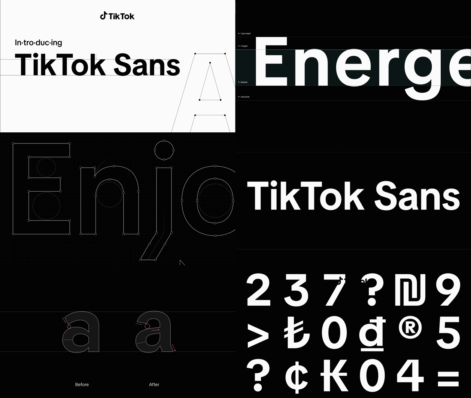
Introducing TikTok Sans: TikTok's new bespoke typeface
I had the privilege of overseeing the development of the new TikTok Sans font, created in collaboration with the type foundry Grilli Type. My responsibilities included providing feedback during the development process and ensuring that the new font would serve our marketing needs while maintaining TikTok's brand DNA. Meanwhile, the product team focused on ensuring that the font would work seamlessly within the app experience. Once the font was launched, along with other team members we took on the responsibility of updating the font guidelines on the TikTok Brand Website.
Previously, TikTok used Proxima Nova font on its platform and Sofia Pro font for all external marketing communications. After recognizing the need for a unique typeface as part of TikTok's brand identity, we decided to develop our own custom fonts: TikTok Sans Text for in-app use and TikTok Sans Display for all marketing communications.
TikTok Sans Display Bold is the primary font for most external marketing communications. Its unique and modern geometric sans characteristics and curves create a dynamic feel, perfect for communicating and capturing the energy of the TikTok brand and its users. TikTok Sans Text enhances legibility on the platform by incorporating an optically larger font, increased line height, and efficient letter spacing. This font is also ideal for longer copy and body text in digital applications.
TikTok Sans Display
Our primary font weight is TikTok Sans Display Bold, which is used mainly for headlines.
TikTok Sans Text
The secondary font weight is TikTok Sans Text Regular. Its balance makes it suitable for longer instances of text and interface copy.
Close leading
Leading is lowercase ‘x’ height or less. This will ensure that we are creating tight compositions. We want the type to feel compact, without it touching letters from other lines. For example if the type is 72pt, the leading should be less than 72.
Tracking
TikTok Sans has a balanced and considered kerning. This means that 'optical' kerning and tracking should always be set to default number '0'.
Sentence case and centered
Headlines and hero typography should be set in Sentence case, optically centered on central axis. Sentence case follows the standard rules of sentence structure for proper capitalization of people, places and events.


